Hi! I’m Sarah - I spend my days at Hashboard obsessing over our customers and digging into how our team can create a delightful product to help teams build data driven cultures. My background is in consulting, so I’m always asking “why” and excited to peel back the layers on complex problems.
I joined Hashboard in January because I personally related to the struggle of being a non-technical user, desperate to get my hands on data, but not having a great way to do so. I couldn’t resist the opportunity to help build a team and product that is working to bridge the gap for data teams and the business.
If you have any questions about what we’re building - and WHY we’re building it - please reach out to me, I’d love to connect and hear from you!
When it comes to building a data driven culture at your organization, there are endless opinions and tools to help teams embark on that journey.
In this post we’re starting at the very beginning. If your organization or team is early stage, you’ll inevitably find yourself asking the question of, “Is it time for our team to graduate from visualizations in excel?!” The guide below will help you determine if it’s time to answer ‘yes’ and level up your business intelligence.
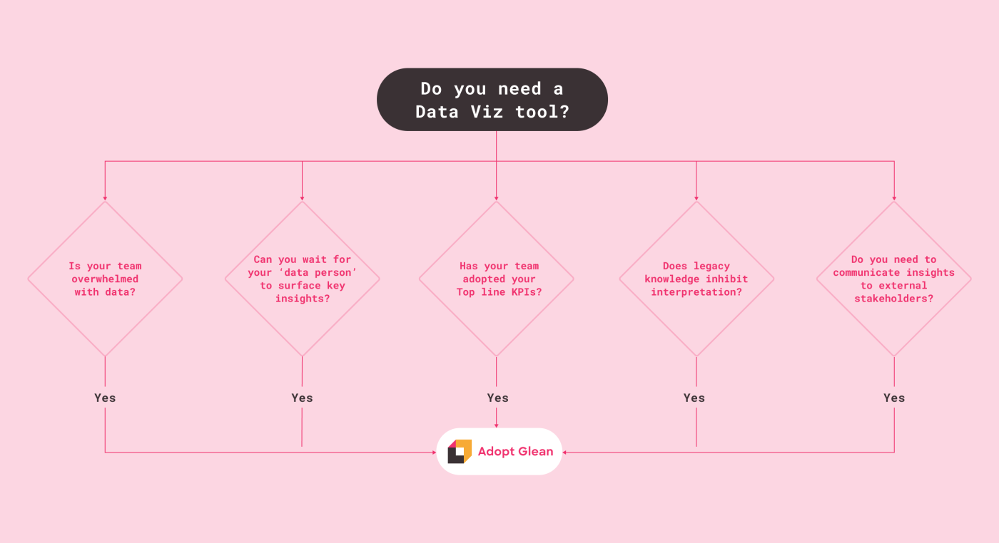
1. Your team is starting to get overwhelmed with increasing amounts of data: When you’re early, analyzing data doesn’t make sense…because there isn’t enough data! You have five customers, you know them by name and you pretty much know everything that they’re doing. But, at a certain scale it’s hard to manage things without data. This point comes much sooner for particular business models: ad tech and consumer for example. Another factor is growth - as your business grows, you'll be collecting more and more data about your product usage, customer information and internal activity. The data gets larger and more complex, if it’s not maintained it will become useless. As you grow, fast monitoring becomes essential as you’re going to need to easily access and understand this data in order to scale.
Pro Tip: If you don’t already have a data warehouse set up, we would suggest putting it on the to-do list! Here’s a guide on how to set up a data warehouse in 30 minutes or less. If setting up a dwh is out of the question for your org, there are still options! For small to moderate data sets you can use DuckDB + Hashboard to upload CSVs and visualize your data.
2. You can’t afford to wait on your “data person” to surface key insights: As your business grows, each person on your team is going to need to make decisions more quickly than before. This may look like customer success teams that are under pressure to deliver answers faster to customers. Or it could be that your product team needs fresh and dynamic data to solve critical product issues or to inform major roadmap decisions. If this entire process is stuck in a bottleneck because you’ve been relying on one or two data people, ring the alarm bells! Having a self-serve data visualization tool in place will help all folks in your org quickly analyze large amounts of data, identify important insights ad unblock themselves. This shift will free up your data folks’ valuable time for high leverage questions and projects.
3. Top line KPIs haven’t been evangelized to your entire team: If your organization’s KPIs are keeping you up at night, but you have a sinking suspicion that half of your company has no idea what they are, it’s time to get everyone on board. Visualizing and visibly tracking progress of your company’s critical KPIs is the best way to get every single person engaged - gone are the barriers of “I don’t know SQL” or “I don’t have access to our data warehouse.” Creating a simple dashboard to track KPIs is a great starting point.
Pro Tip: Current Glean customers leverage our Slack integration to share out org-wide goals to every single employee weekly. Choose what you want to share and how frequently with our automated reporting feature. If your team has already done the work to define and track KPIs, sharing should be the easy part!
4. Difficulty interpreting data due to legacy knowledge: As your team grows you’ll quickly realize that the way in which data was stored and interpreted in the early days may cause mass confusion for newcomers. When you’re frequently hearing questions like “How exactly do we define account?” or “Why are there marketing metrics mixed in with product analytics?,” it’s time to start clearly defining your metrics and documenting everything along the way. Visualizing these core metrics with documentation side by side provides your users with an easy workflow to absorb both the data - but arguably more important - the context that makes the data meaningful! Glean’s explore links also make sharing context alongside your data incredibly easy.
5. Need to communicate insights to external stakeholders: If you’re considering raising another round or providing your customers with analytics, things are bound to get complicated. Sending a spreadsheet + a word doc with context + an email with additional commentary is not an effective way to communicate. It will likely result in either 1) no one ever looking at your data or 2) the floodgates will open with questions due to the data being static. Communicating insights in a clear and visually appealing way will guarantee higher engagement and happier customers. Don’t let a subpar data visualization be a distraction from the amazing results you have to show off!
It absolutely can be challenging to invest up front in cleaning up your data and implementing a new tool. However, the tradeoff is that you’ll be able to free up your data team’s valuable time to work on more impactful projects.