
I joined Hashboard at the beginning of this year. In my previous lives as a consultant at IBM and strategy consultant at Pendo, I’ve always been a classic 'end user' of BI tools. I would dig through a dashboard that was sent to me and proceed to ping the data team with a million questions 😅
As Hashboard's GTM lead, it’s been refreshing to easily get ramped up using a business intelligence tool (Hashboard, obviously!) to build out my own use cases and examples without getting majorly blocked by technical barriers.
While I have enhanced my technical skills since joining Hashboard, I am still not very SQL savvy or familiar with setting up data in a warehouse. Lucky for me the datasets I use to build product marketing content are typically either available in CSVs or someone on the team has already set up demo data in our BigQuery instance.
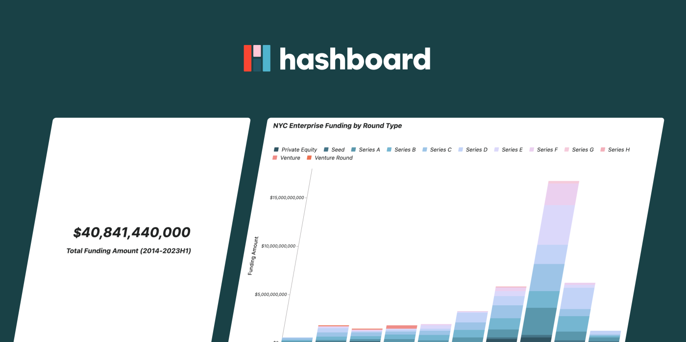
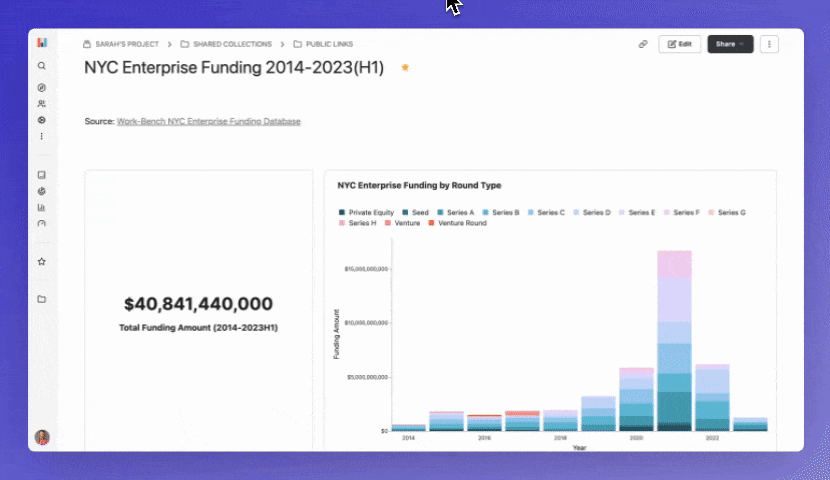
For this example I’ll walk you through how I built out this NYC Enterprise Funding 2014-2023(H1) dashboard. If you’re interested in the raw dataset you can get it here from Work-Bench. If you have interesting datasets from your product or research that you want to share publicly, this guide is for you!
Step 1: Preparing the Data
I downloaded the raw dataset and combined all of the tabs into one large table with four columns:
Company Name
$ Amount Raised
Financing Round
Year
I saved this as a CSV and was ready to jump into Hashboard! For users that have more complex datasets, we do recommend that they denormalize their data before using Hashboard. You can also model with joins natively in Hashboard, but denormalization (creating one flat table) is the quickest way to get started.
Pro tip: A row count measure is required in Hashboard. In this example, my ‘row count’, which I renamed, is the number of rounds raised. More on that in the next section!
Step 2: Connecting and Modeling the Data in Hashboard
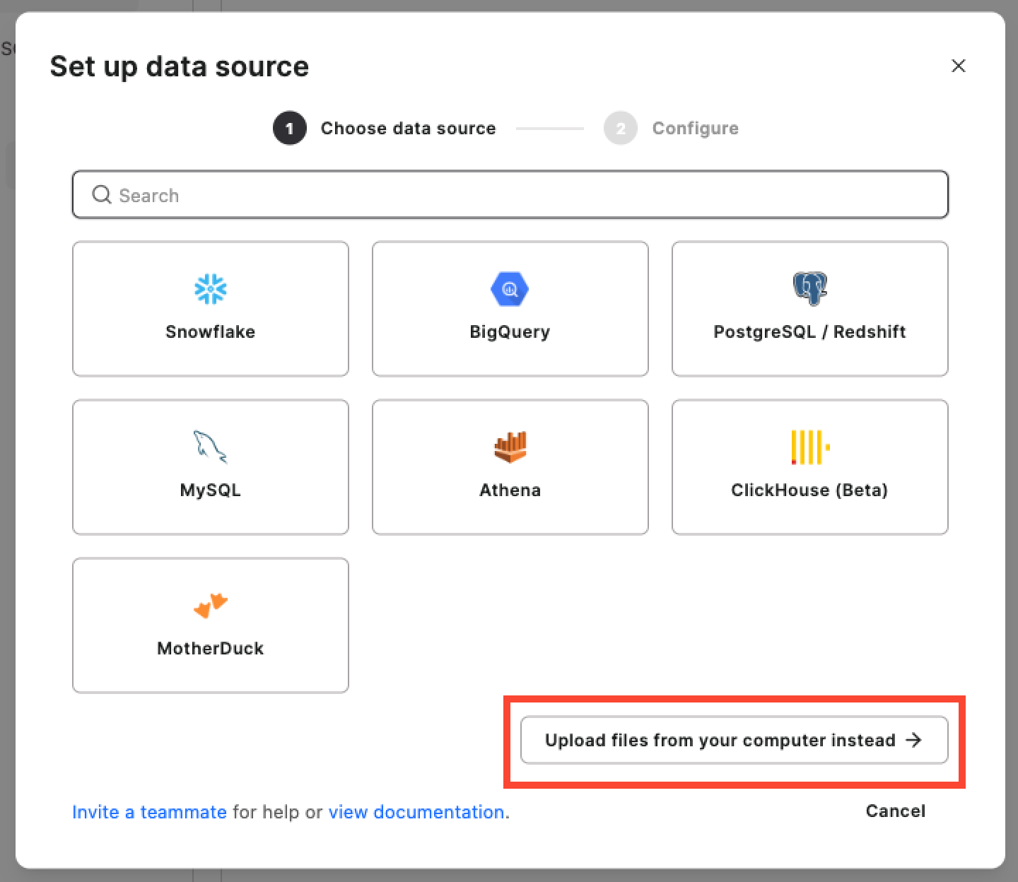
Hashboard connects to all major databases in the image below. For smaller datasets like my example, you can use DuckDB or MotherDuck to upload CSVs, JSON and/or Parquet files. I kept it super simple and uploaded my CSV file.
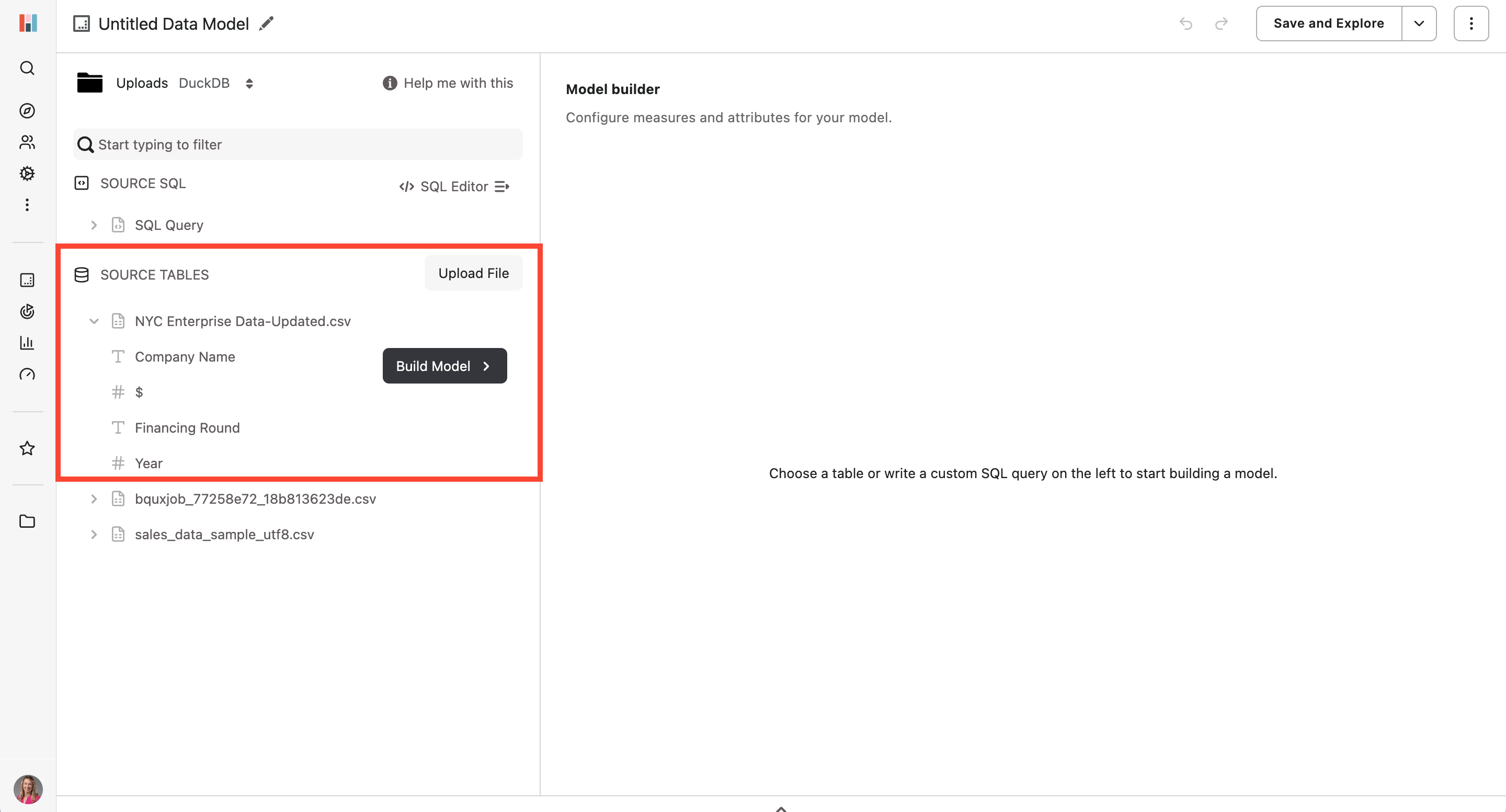
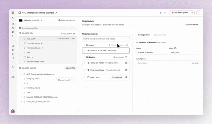
 After uploading my file, I can start working in Hashboard’s model builder. I can see the preview of the column names and validate that I’ve uploaded the correct file. From here, I click ‘Build Model’ and start selecting the data to want to include in my model. In Hashboard data models have ‘Measures’ and ‘Attributes.’
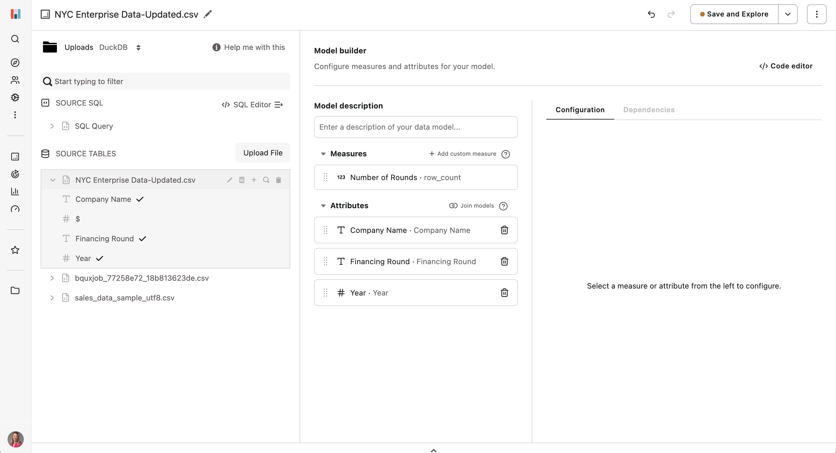
 Measures are measurements that can go up and down over time. Each measure should map to a measurement of a process or workflow in your organization. Counts of events, revenues and cycle times are common examples of measures in data models.
Attributes are the main building blocks for data models. They enable filtering and grouping when exploring data in the product. For a marketing data set, examples of attributes include events, user ids, campaign type, referrer link, etc.
Like I mentioned above, a row count measure is required when building a model. Hashboard automatically identifies this and pull it into the Measures section of the model builder. In my example this is number of rounds raised.
At this point my model looks like this:
 You can see above that I don’t have a primary date time attribute. This is something I need to use as my default because I want to create time-based data explorations. I phoned a friend, aka one of my colleagues, to help me with some SQL.
Using Hashboard’s SQL editor I wrote (with the help of engineers!) this SQL query to cleanup dates and ran it to rebuild the model to get my primary date in the correct format.
select * exclude ("$"), strptime(cast(year as string), '%Y') as date, "$" as "Amount Raised $MM"
from "NYC Enterprise Data-Updated.csv"
Last thing to do in the model builder is to add in a custom measure of the funding amount. I selected ‘Add custom measure’ and configured exactly how I wanted the data to display. Just a tiny bit of SQL was needed to make this happen.
 Step 3: Exploring the Data!
I clicked ‘Save and Explore’ to exit the modeling workbench and enter the data explorer. This explorer is Hashboard’s bread and butter - I love that I’m not dropped into an empty canvas and immediately have a starting point to click around. For teams building self-service data, this will be the starting point for most users!
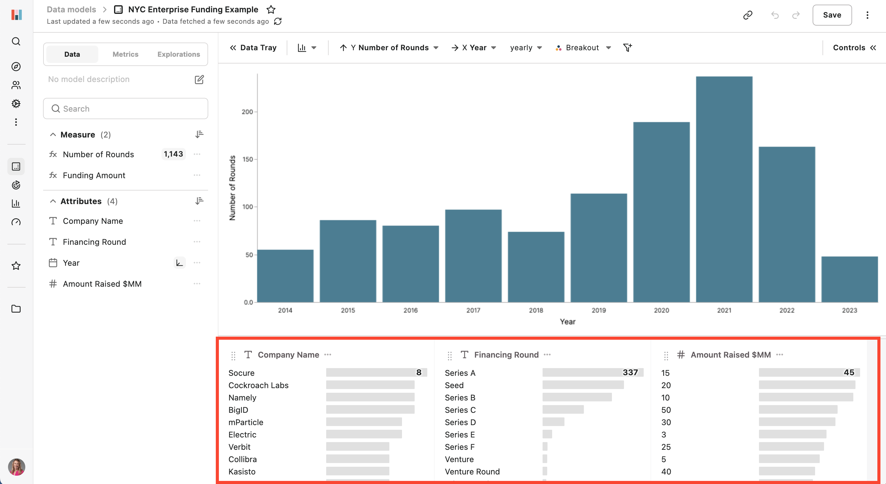 You can see in the bottom attribute tray all of the data has automatically been profiled and sorted - answering a lot of my questions right off the bat!
The first thing I wanted to see was a breakdown of the funding amount and round type per year. To do this I changed the measure on my Y axis to ‘Funding Amount’ and broke out by ‘Financing Round.’
As a principle, when using ‘breakouts’ in Hashboard only the top six items are included. Everything else is grouped into an ‘other’ category. For this example since there weren’t a lot of rounds it made sense for them all to be represented by different colors. However, with much larger datasets this feature is super handy to help profile data in a more consumable way! Breakouts are very configurable: you can breakout as many items as you want and have them respond to new data by selecting the "top N items" for a given attribute.
 Step 4: Finalizing the Dashboard & Sharing
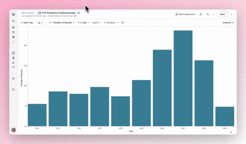
After creating more explorations with views including number of rounds per year and companies that have raised the most, I was ready to add them to a dashboard. Dashboards in Hashboard 🤭 are super easy to make with the drag and drop toolbar.
 One of my favorite features is that each tile is configurable, making it super easy to customize the view of each chart! You can add any saved exploration, metric, external content via embeds and text with markdown.
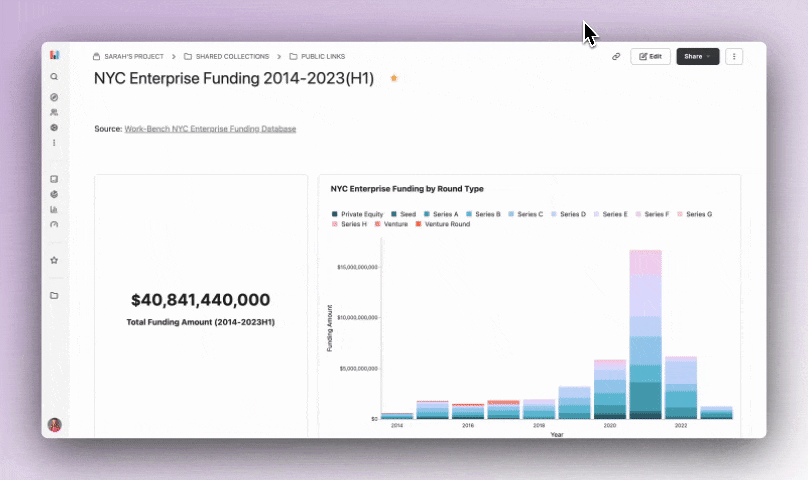
I chose to add a couple of the saved explorations, metrics and the source data table at the bottom. For my public examples I always include the raw dataset so people have the option to see the behind the scenes - you can see it at the bottom of this dashboard.
Since I built this example to be shared on LinkedIn and other places for reach, I used the public link sharing option. By publishing a dashboard this way anyone on the internet can access it, which is a great product marketing hack!
 Viewers are able to hover over each data point, but don’t have the ability to add filters or view the underlying data. This is also a great way to share non-sensitive information with customers and/or investors - a common use case for a lot of our users!
If you’re interested in trying out this example or setting up your own in Hashboard, you can get started today for free by signing up here. Building and sharing out relevant datasets is a super powerful way to engage your audience - even if you’re not in the BI space. Let me know what you build or if there are examples you’d like us to create in Hashboard, I’m all ears!