
Somehow you got tasked with building the dashboard to track [ fill in the blank ]. It turns out, there’s a lot of disparate skills involved in making a BI dashboard, not just data engineering skills. Sure, you’ll need some data manipulation skills, but you’ll also need visualization skills, analytical skills and product skills to make a useful dashboard people will actually use.
The goal of this post is to give you a blueprint for the end-to-end process of building your first metrics dashboard that will actually get used.
The trick: most of the impact isn’t actually about the dashboard, it’s about the people.
Most dashboards and data tools don’t get used and are quickly thrown away. Here is a sure-fire way to make a reasonable-looking dashboard that actually gets engagement.
Pick a user, pick a usecase
Get the data. What data should you use?
Blueprint for your v1 dashboard
Five charts to put in your dashboard
Follow up, schedule and track your dashboard
A template you can start with for most dashboards.
Pick a user, pick a usecase
It turns out dashboards are a sort of product, so product is a useful lens to think about when planning out your dashboard.
To make a great product, you will want adoption. To think about adoption, I find the most critical question is: will the data you show somebody going to help them do their job better - will they get promoted because they drove a number in your dashboard or were able to act on it?
Or is there some other deep intrinsic reason somebody needs to see this data? The best data people are also product people, so dig into the uscase: Is the goal to find patients for a clinical trial? Is it to track (and drive adoption) of a feature? Is it to pick items with a robotic arm with higher quality?
There are frustrating knowledge gaps throughout your organization, you can hear them in meetings if you listen closely. Somebody on the customer success team wanted to engage a customer before they churned, but they just didn’t have the information at the right time.
The most important part of identifying a usecase is identifying a user. A dashboard that is demanded by an executive because some business process failed will never be useful unless it’s somebody’s job to track that number and they will get promoted when that failure rate goes down.
Do research to understand your users and what they need and care about.
Most dashboards fail because:
nobody actually cares about the numbers you are providing
the numbers don’t vary in a way that feels controllable (or actionable, high resolution data is not actually made available)
they can get the data in a more convenient place (you aren’t actually filling a knowledge gap in the organization).
If you’re just supporting a one-time decision: don’t aim to make a dashboard that exists in perpetuity. Build a one-off analysis and plan to archive your work when it’s done.
Getting data
Once you figure out what your usecase is, you need to map out your data and users. For your users, ask: when will they need the data? Is there somebody who will want to track this on an ongoing basis? How often can changes in action / course impact your metrics? Are you looking at this every day? Are there existing operational workflows you’re integrating with?
I recommend sketching out the high level metrics and the important dimensions with your users. Draw a spreadsheet together. Data modeling is an entire discipline in and of itself - check out Agile Data Warehouse Design, it has some great, iterative and lightweight tips on modeling data (away from ERD’s and heavy dimensional modeling processes).
There are three ways that you might have or get to a reasonable set of clean data to start from:
Sometimes, you’re early on and you don’t have that much data, so it’s naturally pretty simple and clean. You just have 1000 sales and they all fit in a spreadsheet - great! There probably isn’t that much cleaning to do.
You spend some effort adding instrumentation and collecting the data (survey, instrument some system etc.)
The required data is already available, but it’s in disparate systems and you spend time modeling it and joining it together.
From my experience, (3) can be tricky and a bit of a trap in larger and more complex systems. Sometimes you can convince yourself that you can get at something with business rules or a surrogate measure. I’ve seen this play: “we don’t actually know when payments happen but we know when somebody visits the the payment page. Maybe we can just look at payment page visits and when somebody click the pay button… but only if they have been on the page for X amount of time.” This can be a trap and going back and instrumenting things explicitly or collecting from the source of truth is usually more useful.
A dashboard is only going to be useful if users trust it.
A pro tip: look at your data in it’s raw form with your users as soon as you possibly can. Ask them to QA specific examples and if all of the attributes, dimensions and measurements (payment amounts, dates etc.) align with their expectations. This has three impacts:
They will probably be able to point at issues and flaws in the data and business logic. So quality is better🤘.
This also means you will have another expert in the underlying business logic. So knowledge is more distributed 👨🎤
This also builds trust in what you’re building: if your users are very confident in the underlying data by the time you release, you’re going to be most of the way to adoption 🎸
Blueprint for your v1 dashboard
So now you have the data. How do you actually present the data? It turns out, this can be somewhat daunting. For me there’s a quick hack to help you build a first version of your dashboard every single time. This will depend on the usecase a bit, but if you start with these pieces you probably won’t be embarrassed by your v1 dashboard.
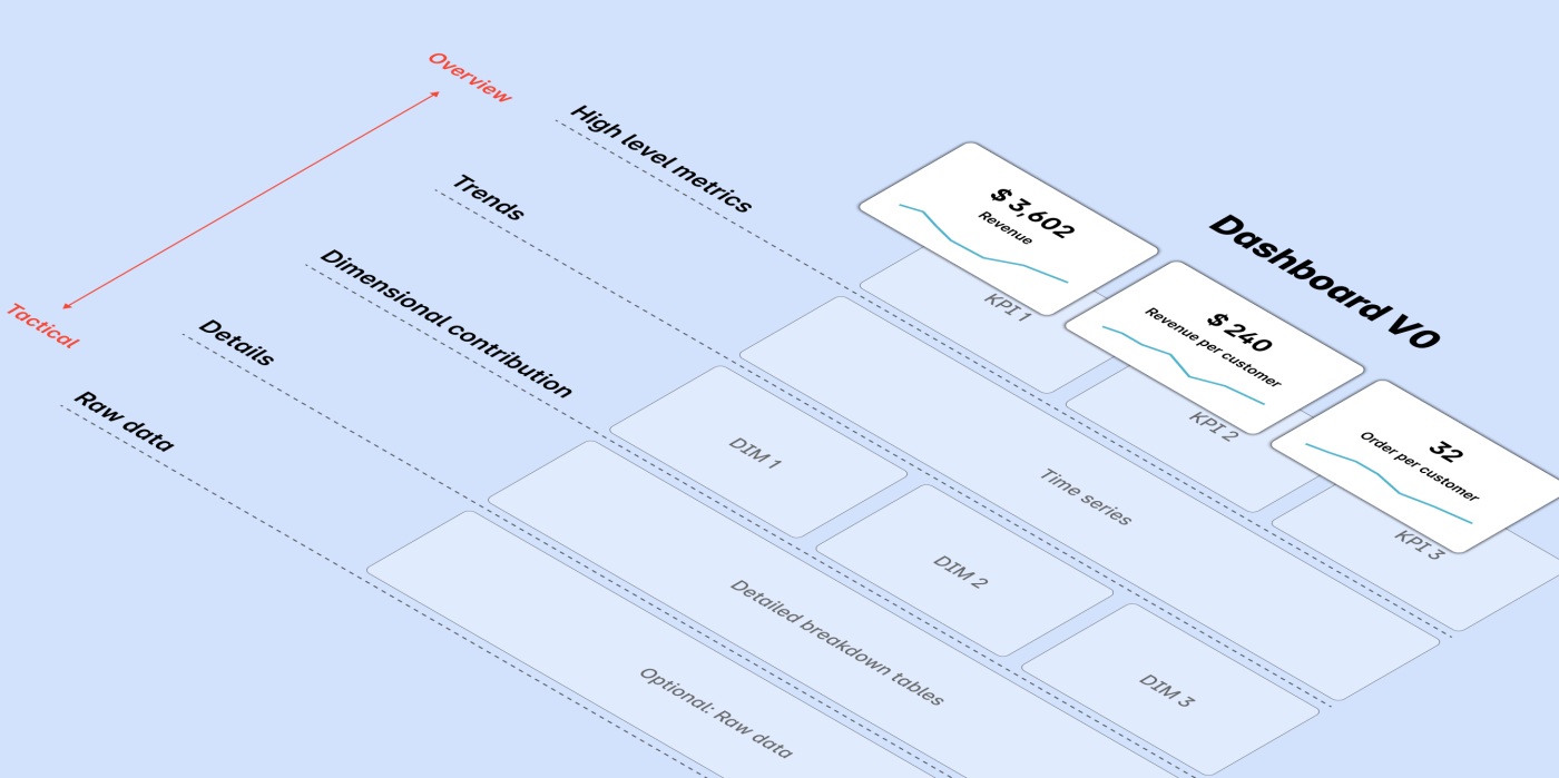
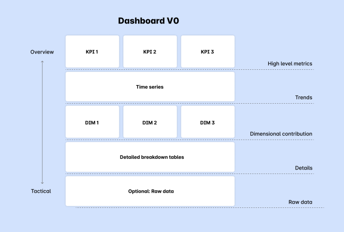
The overall strategy is to put high level things at the top of the page, the middle of the page will be trends and then important breakouts and you get to details and actionability at the bottom of the page.
Tiles
You probably have some high-level metrics KPI’s and maybe secondary metrics. For example: you might have Revenue as a primary metric and price per order, number of orders and number of customers as secondary input metrics.
Set these up as metric tiles at the top (preferably with goals listed explicitly).
Trends
The next question is almost always “how is this changing over time, is it going better or worse”. Give the people what they want: include spark lines in your metric tiles and create a typical “run rate” chart. I often add a single breakout in the run rate chart like status (in the case of claims data, status is critical for understanding the number of claims in each status).
Dimensional drivers
The next natural step is to drill down into specific drivers or dimensions that influence these trends. This is where dimensional drivers come into play.
From your initial modeling exercise, you should have a good idea of the attributes of data that you expect to drive metrics. From here you can segment your above chart to see how it varies over time, and you can filter into each of the data items within each dimension to start to try to draw some insights about how metrics are changing.
Details and drilling
Actionability comes from getting down to the details of data. If you’re tracking revenue for example, you’re going to want to see which specific orders / customers are driving tons of revenue. You'll want to dig into outliers and see examples. From my experience, it's very hard to build trust in data without letting people see detailed, unaggregated data. Many BI tools (like Hashboard) will let you click to investigate underlying data which works well for letting people dig in and inspect root causes and gain intuition for what's happening on the ground. You can also insert a table of examples at the bottom of your dashboard which can also be nice so you can see examples in parallel with aggregates as you filter data in your dashboard.
After it lands and followup
Now your dashboard is launched and shared with your coworkers. Here’s a quick checklist of what you’ll want to do to make sure you get engagement.
Get stakeholder feedback (hopefully you’ve done some of this before you go live)
Make sure it’s clear what your expectations are, documented right on the dashboard (either in markdown or in a comment). Should this be checked every day? Every week? Also, how much QA did you do, what’s your expectation for errors?
Provide a dashboard owner and channel for getting support: how do people reach out for help.
If useful, set up a formal forum to review metrics: either a meeting like a metrics review or asynchronously.
Schedule to Slack or Email (if useful)
Track usage and utilization: in a month, if nobody has checked the dashboard your bias should be to archive it and let everyone who has looked at the dashboard.