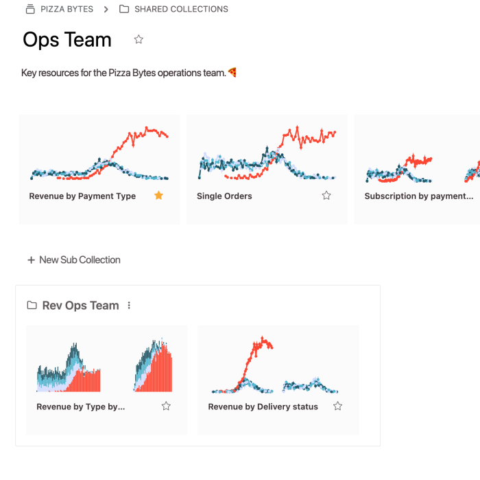
Explore your data as a team
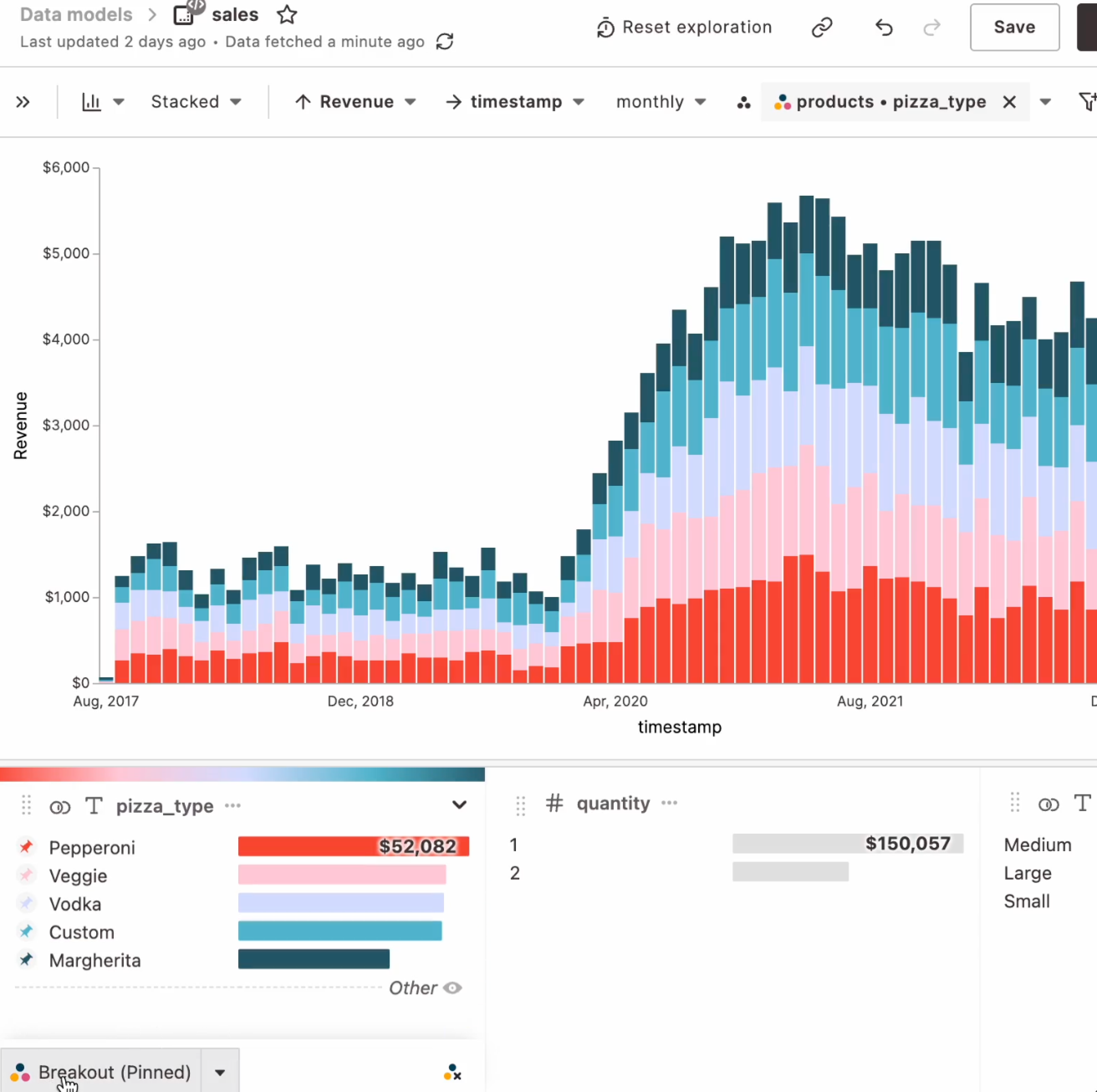
Hashboard’s intelligent defaults and automatic profiling empower you to drill into tactile data whether you’re a SQL pro or non-technical team member.
New! Check out our free BigQuery cost analyzer - built with Hashboard BI-as-code
Hashboard’s intelligent defaults and automatic profiling empower you to drill into tactile data whether you’re a SQL pro or non-technical team member.
Never start with a blank canvas. Dive right into your data, no configuration necessary.
Click to filter, drill and view underlying data. Automatically avoid overwhelm.
Tackle complex questions, simply. Explore like an engineer.
Make data exploration a team sport with saved views, shareable links and scheduled alerts.
Business intelligence built for engineers. Preview updates and validate changes to your data warehouse or Hashboard resources to ensure your views and dashboards won't break. Use code reviews or pull requests to collaborate on proposed changes.
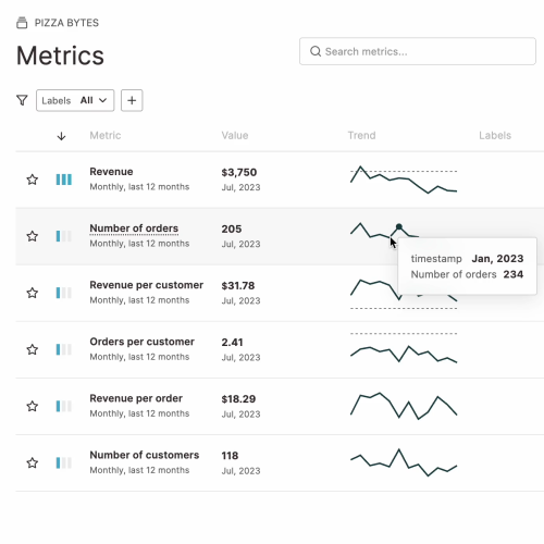
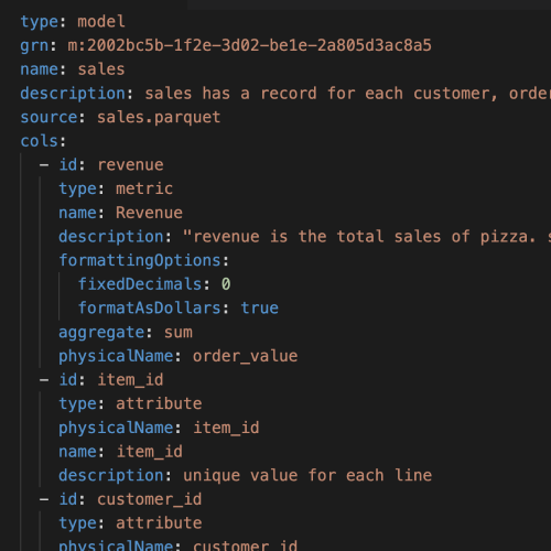
A simple, fast semantic layer, purpose-built for unified organizational metrics and inclusive exploration. Model once with code, SQL or in the GUI and integrate with your existing tools.

Configure Hashboard using the same tools that you use to develop your backend pipelines. Build faster and maintain version control with dbt and Git integrations.