New Charts & Visualization Types 😍
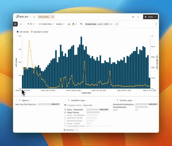
Bar + Line, Multiple Axes, Trellis and More** - Choose from bars, areas and lines to layer on top of each other in the same chart. You can also display measures on different axes and scales, all from the control panel. Explore the data above yourself here!
Transpose Tables - The control panel is full of data viz goodies, including the toggle for transpose tables. Switch the positions of your rows and measures by switching this on.
Dynamic Breakouts - This upgrade to the breakout feature makes it super easy to always look at the most relevant data. Define criteria that adapts your breakout as your data changes.