

It comes in as a simple request: “we want custom colors for our charts in Hashboard”. It seems simple, but doing it well is more nuanced than you may expect.
Just Picking Colors
When you build charts in Hashboard, you’re not just building a single chart, you’re building a jumping off point for future exploration.
Picking individual color values is okay if you are building something one-off, but the issue is that it becomes cumbersome when exploring data. As the series change, it becomes very time consuming to keep the colors up the date, and often results in repeating the same colors twice (making the chart unreadable).
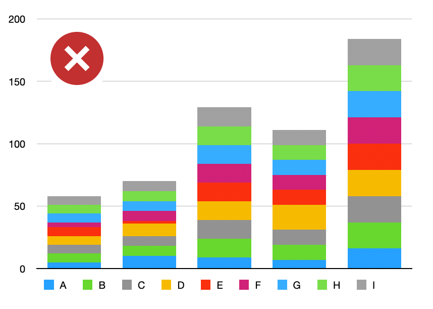
a chart with repeated colors makes it difficult to understand what marks correspond to which series
So Hashboard's approach to colors needs to be more dynamic. If changing the series broke all the colors, that wouldn’t be a fluid experience as you explore, it’d be an interruptive one. We want to allow people to focus on their data, their questions, and their answers. We don’t want to have people bounce into formatting options in the middle of their exploration. Colors need to “just work”.
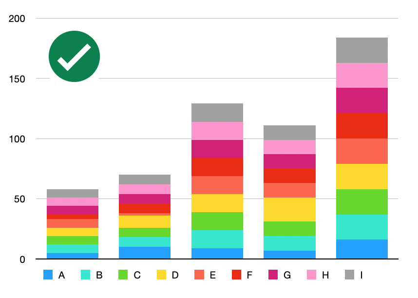 a corrected chart with distinct colors
Color Palettes
Instead of associating a color to each series, a chart has a color palette. This palette is a bundle of colors that fit your brand, theme, or particular use case.
 Hashboard's default palette: “Twilight”
Whenever the charts need colors, the visualization requests a distribution of distinct colors from the palette which maximize contrast. If the chart needs two colors from a three color palette we’ll pick the two most distinct colors. If the chart needs all three, we’ll grab all three.
But what if you need 4, or 5, or 100 colors? It could repeat the provided colors (and we have an option for that) but generally we want to have distinct colors so that all the series are uniquely identifiable.
Interpolation
When the chart needs 4 colors from a 3 color palette, we need to generate new colors. To do so, we need to interpolate.
Map the 3 colors in the palette into a shared color space
Draw connections between the colors
Sample colors along the connection
Form a gradient from the samples
Evenly divide the gradient to produce final colors
Voila! Four distinct colors (two of them brand new), which fit our theme and maximize contrast. If we needed five colors, we don’t even need to recalculate our gradient, we just need to divide it into five segments.
Color Spaces
This process can have vastly different results depending on how you map the colors into a color space.
Using a different color space, we could produce a very different set of colors:
The results from using these 2D color spaces are okay, but if we want a better interpolation from yellow to teal, we need a more nuanced color space.
There are actually hundreds of ways to map colors into a space for interpolation. Many of them are 3D, and a few are 4D!
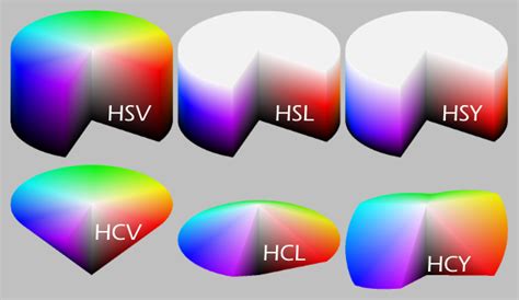
Some commonly used color spaces in computer graphics.
Image courtesy of the University of Kansas School of Engineering
Dependent on the color spaces, we get slightly different results:
In the end, we decided to use the HCL color space, as we found it works well for a variety of palettes.
Colorful Charts
So that’s the ballgame. Simple requests sometimes need careful implementations to preserve Hashboard's first class user experience.
Now… you didn’t think you’d leave empty handed did you? You read a whole blog post about colors!
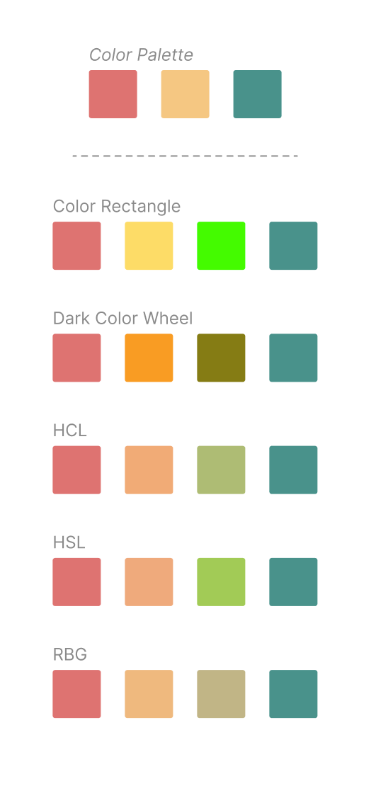
Here’s a couple of great looking color palettes, on us, alongside their DataOps config (Hashboard lets you control your visualizations as code if you desire). You import these directly into your own Hashboard project.
